GPS Quality
The purpose of the GPS Quality Report is to use heat maps to display areas where poor GPS quality is occurring. Different types of maps can be produced to analyse GPS coverage on a site.
- Name: The name will be displayed on any downloaded reports.
- Date Range: Select a time period to run the report.
- Base Grid: Use the max extents to use an auto-generated grid to calculate the heat maps. Select one of the Protools grids to limit to an area.
Settings
- Min Passes: the minimum number of passes in the GPS state to appear on the heat map.
- Max Passes: (auto-calculated) The highest number of passes in the color chart for the heat map.
- Steps: The number of gradations in the heat map.
- Machines: Select the machines to include for the report.
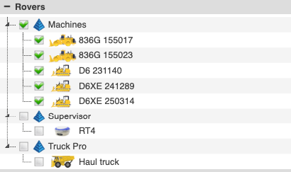
- Limit Machines
Maps
Choose what to display on the map.
- Invalid Positions: Only plot the heat map of invalid (bad) machines passes. Plotted as yellow → red gradient as there are more passes.
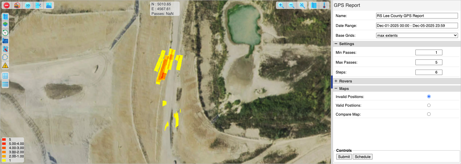
- Invalid Position Report
- Valid Positions: Only plot the heat map of valid (good) machines passes. Plotted as blue → green gradient as there are more passes.
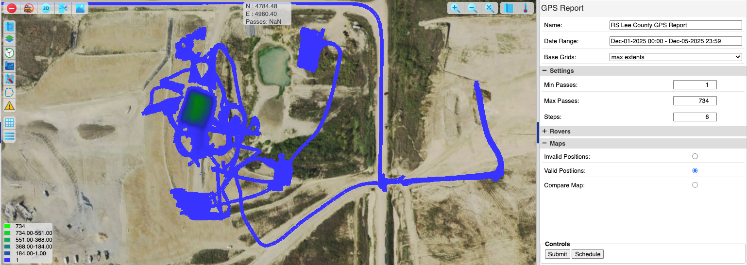
- Valid Positions Report
- Compare Map: This map uses valid passes minus invalid passes to plot a comparison map. If the invalid positions are greater than the valid passes the yellow → red gradient will appear showing areas where bad GPS is more likely that good GPS.
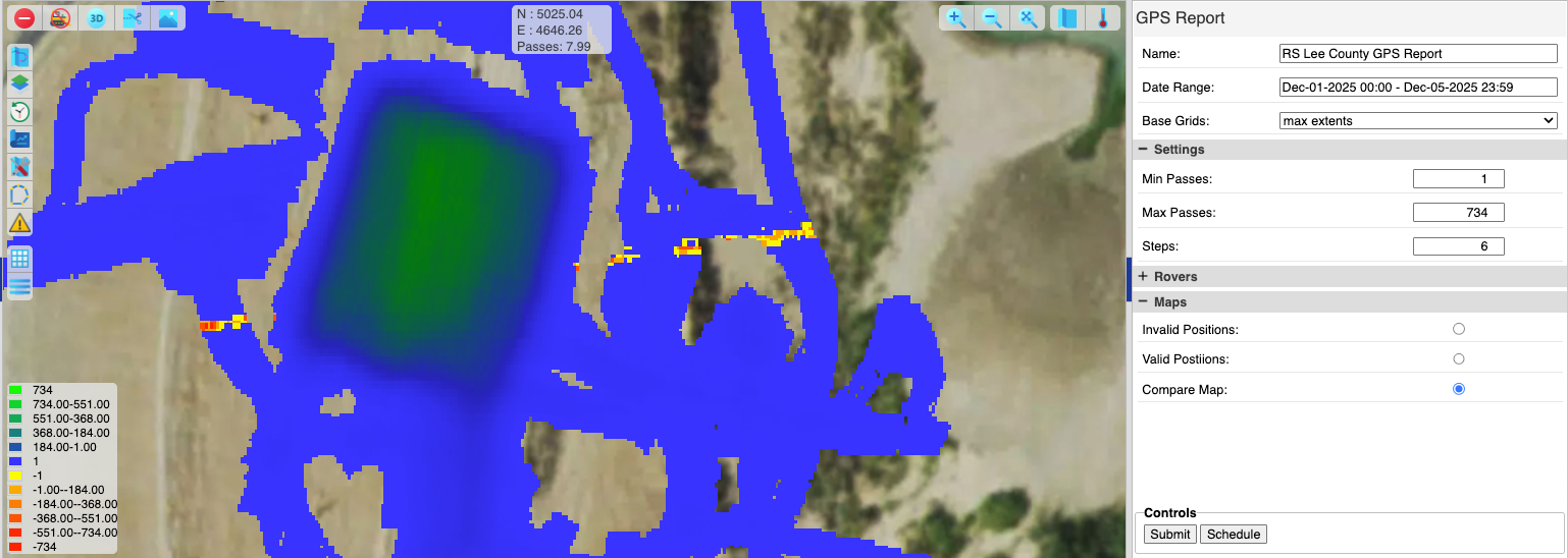
- Comparative Position Report
Press Submit to run the report, get a map plot and open tabs in the bottom panel with more details.
Tabs
Each machine included in the report has a tab in the bottom panel. The tab displays the HDOP and VDOP values for the machine over the period of the report.
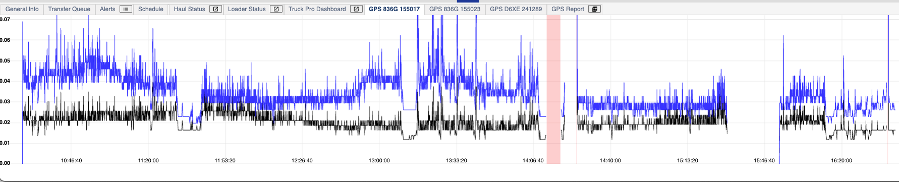
Machine GPS Quality
The GPS Report tab shows total gradation of invalid passes using the Min/Max passes and Steps settings.
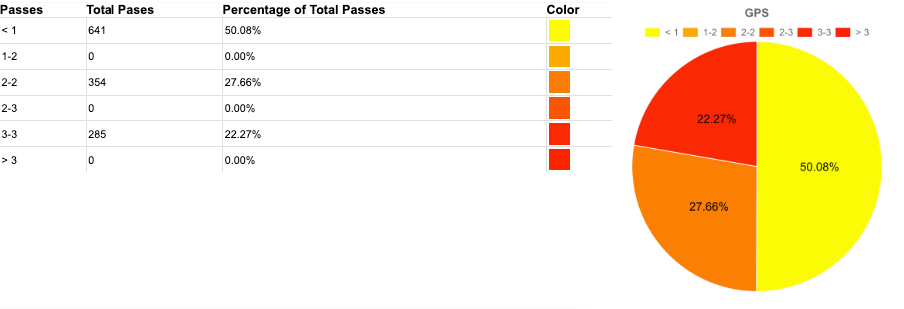
GPS Report (Graph)
The PDF button on the tab will download a PDF of the report chart and the currently displayed map view snapshot.
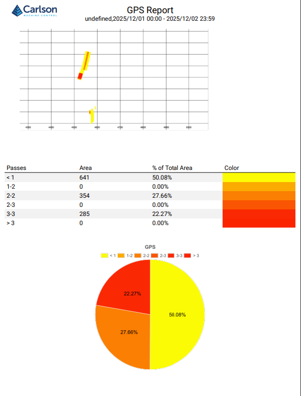
GPS Quality (PDF)